Yorokobu launched a design challenge to represent the magazine. In this magazine 11 artists were invited to create a character per artist (for the back cover) which compone the claim “Start moving” as part of a branded content action with Seat. This was the proposal I made based on technology, movement and optical hypnotisation.
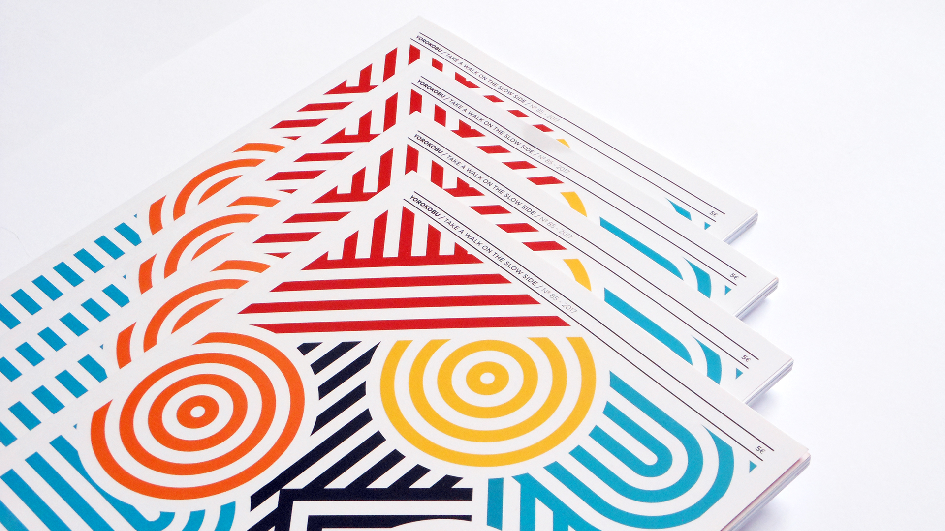
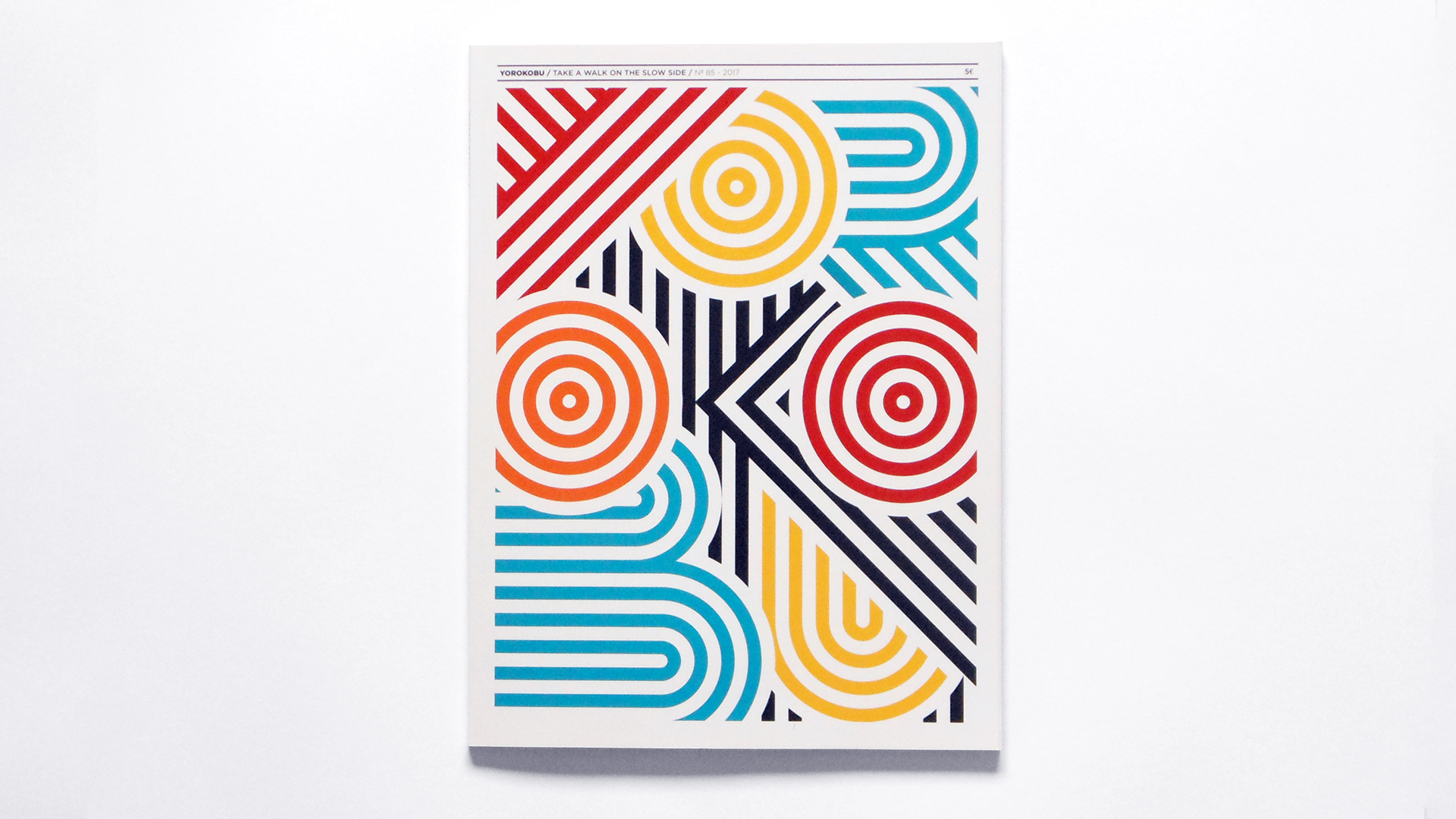
Yorokobu is a magazine based in Madrid focussed on the slow reading, as response to the fast feed content of nowadays. They want to create a relaxed space for analysis and reflexion on the world of brands. They feature illustrators/artists on every single cover and challenge them to interpret ‘yorokobu’.
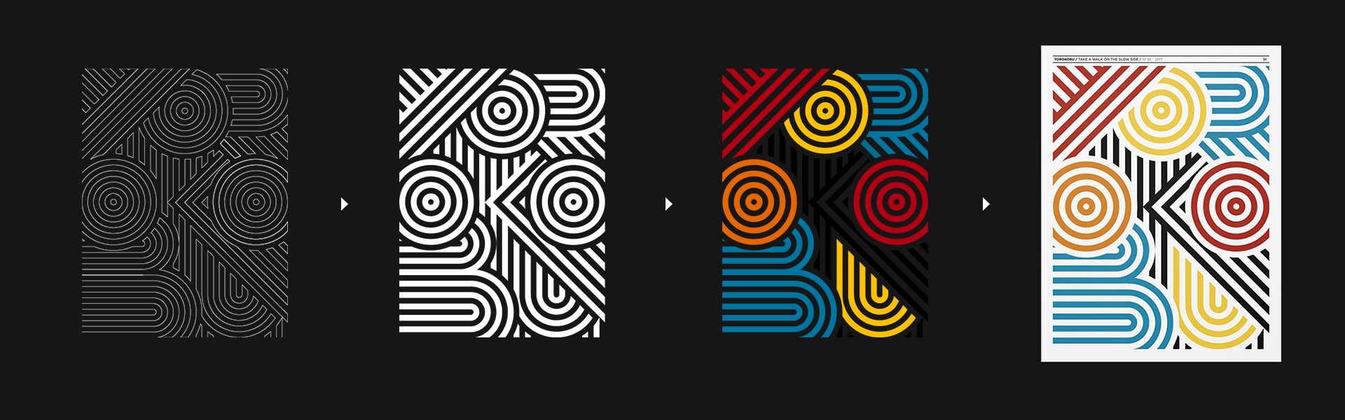
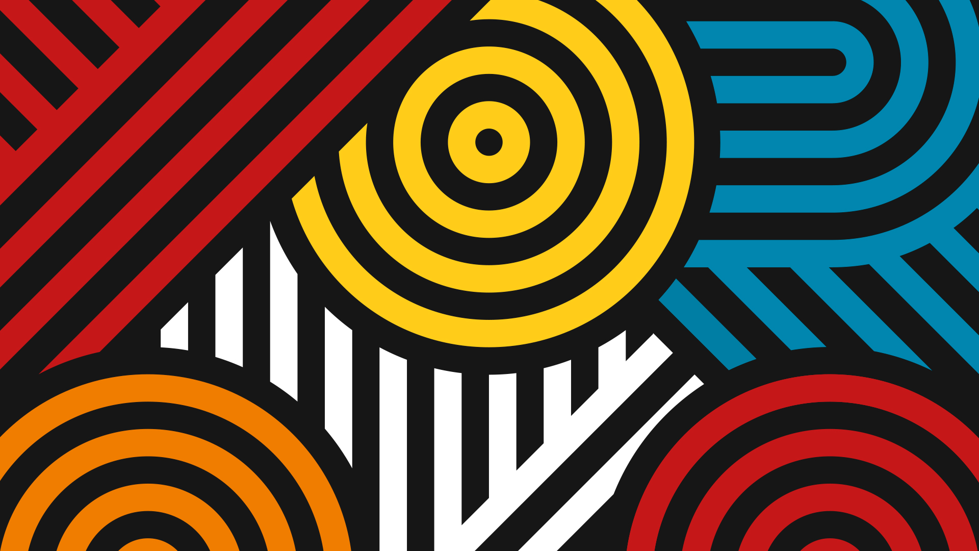
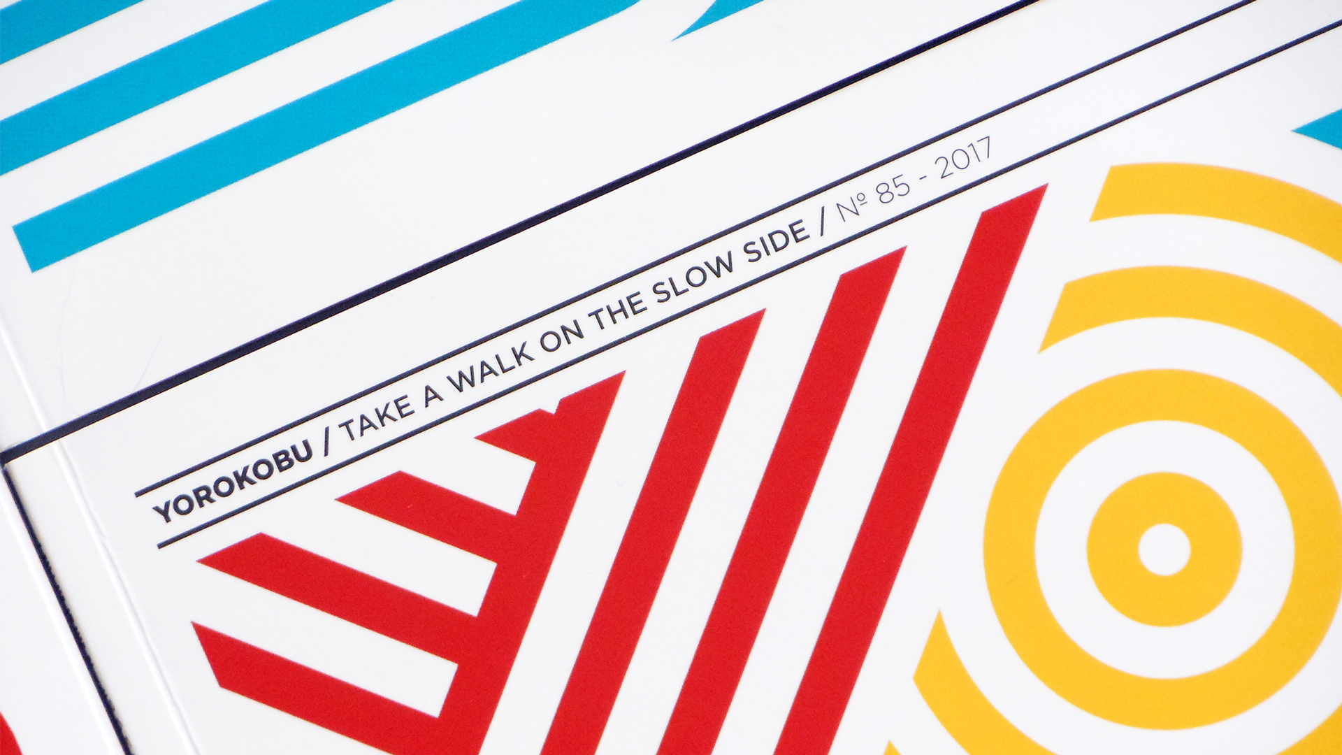
This cover collaboration with SEAT sponsored the front cover as part of the launch of their updated Ibiza model. The cover had to communicate the word ‘Yorokobu’ (“to be happy/pleased" in Japanese) and reflect the new SEAT Ibiza philosophy: “Start Moving”. No other brand a part from Yorokobu could be shown on the cover. To create this cover was required to use the colour palette provided: Seat Red, Barcelona Orange, Barcelona Blue, Ibiza Yellow, Black and White.
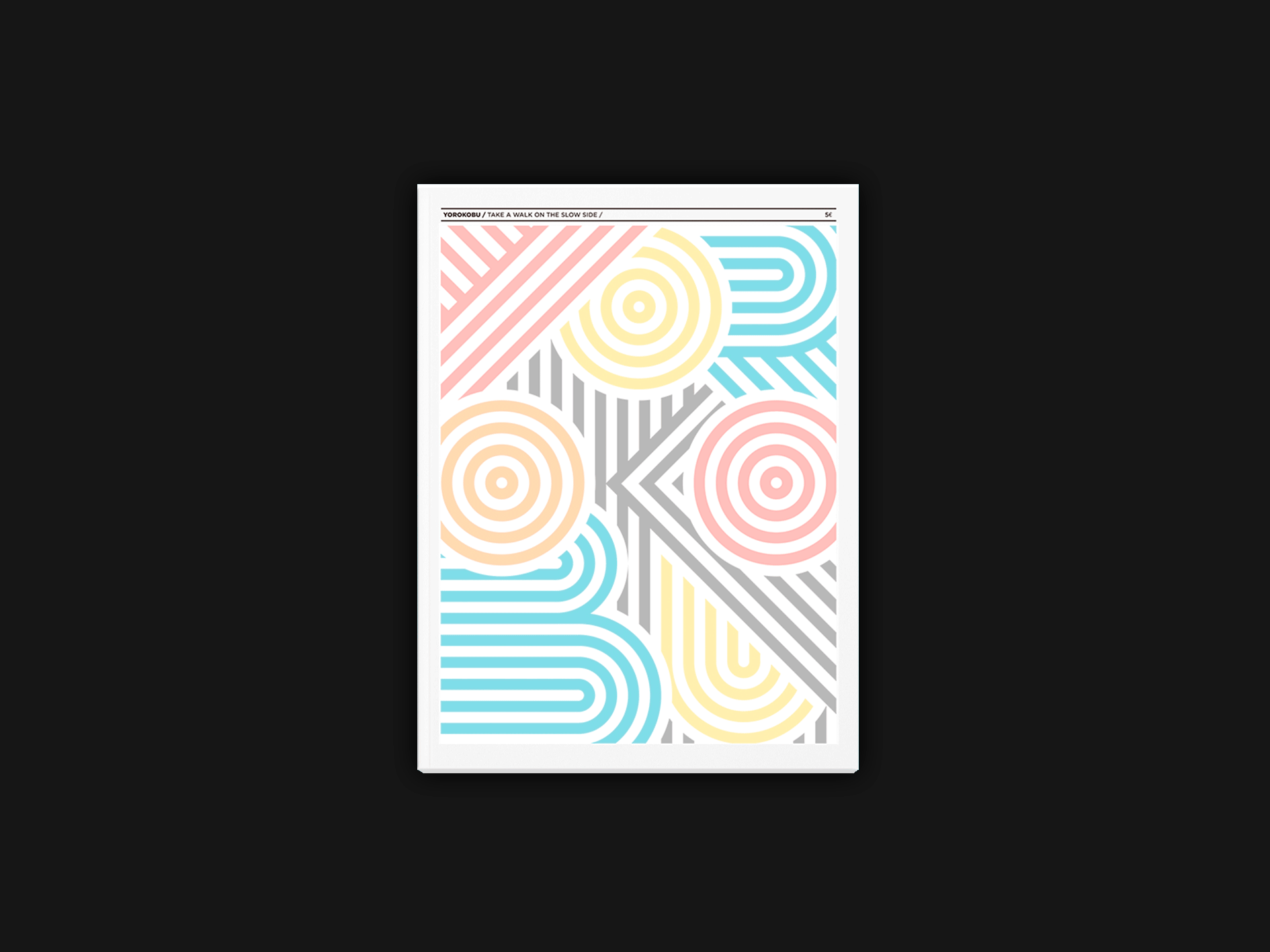
Inspired by OpArt and technology the lettering was based on geometry that unveils magazine's name. A maze that keeps you moving.